green acres before + afters
/This home was SO MUCH work! And if we’re being honest, Im not sure we were that excited about buying it. It was one of the worst kind of houses we see as it had been hodge podged together for many many years. I think it had 3 different “additions” on the house that all had to be torn down. Needless to say, the demo on this project was extensive! But in the end, the house was able to be transformed into something to be proud of and we sold it to a young and growing family.
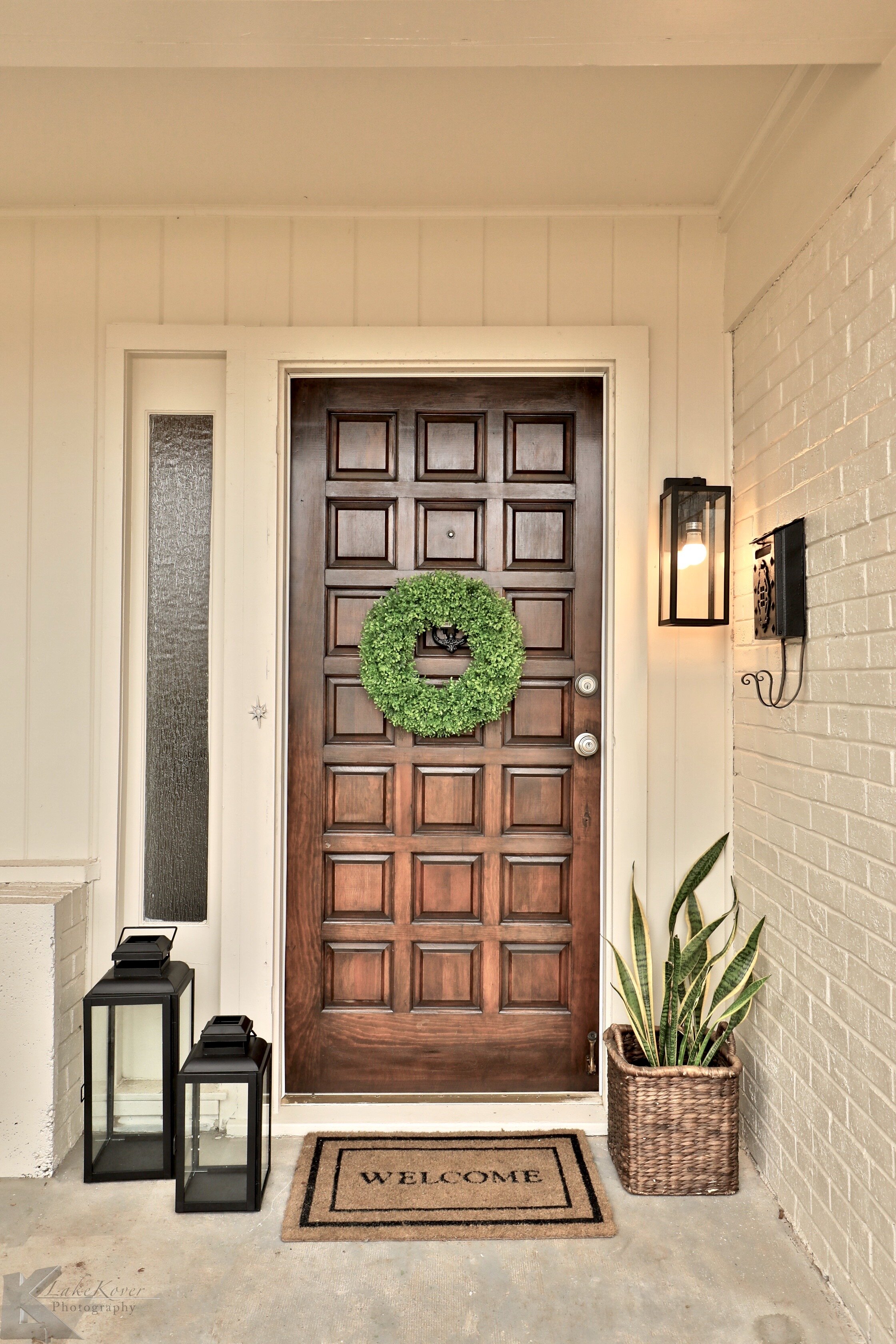
But, it had this cute front door that we saved! It was a gorgeous solid wood door and had all the character. We painted the exterior a creamy white with a darker taupe trim color.
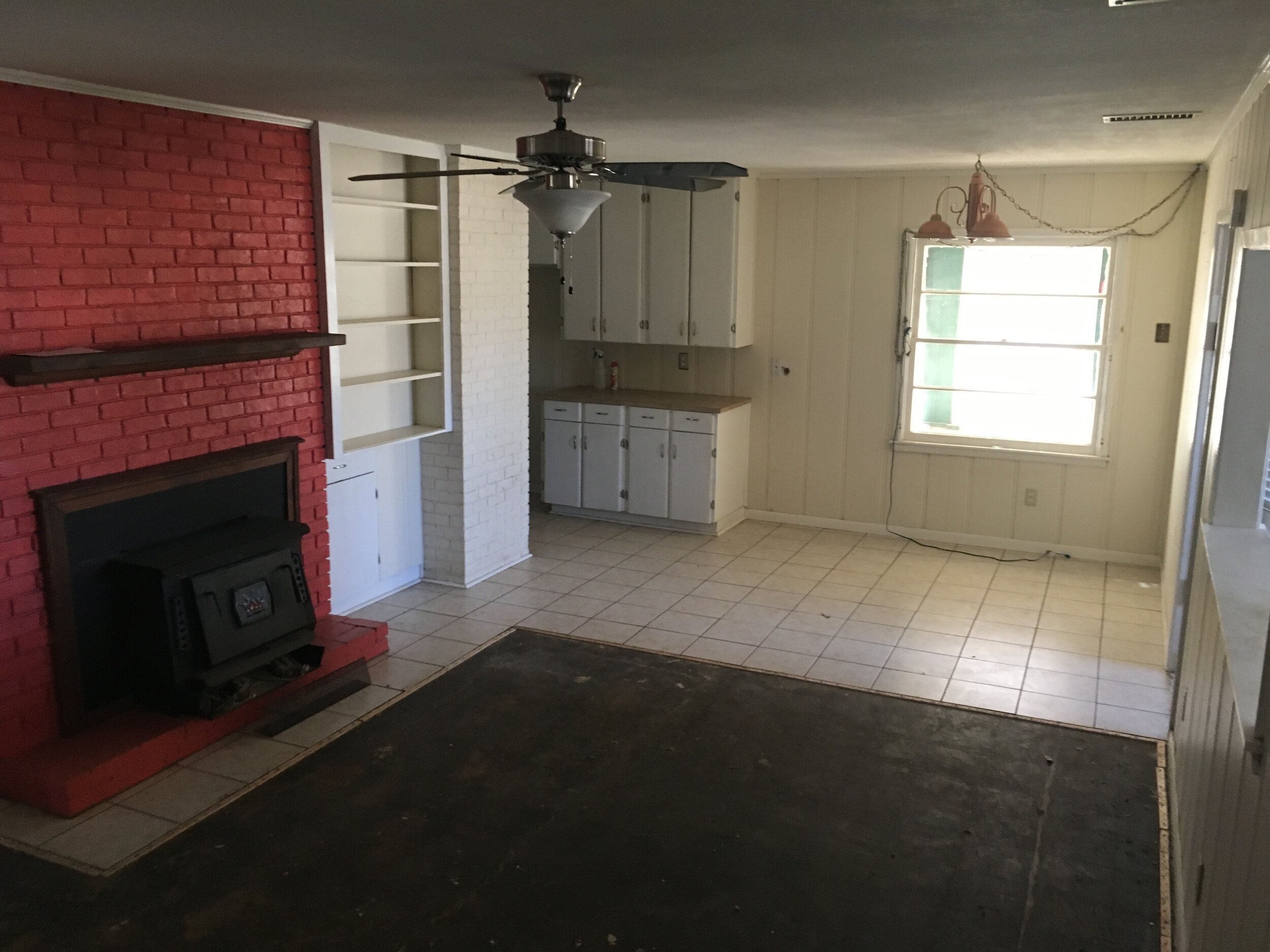
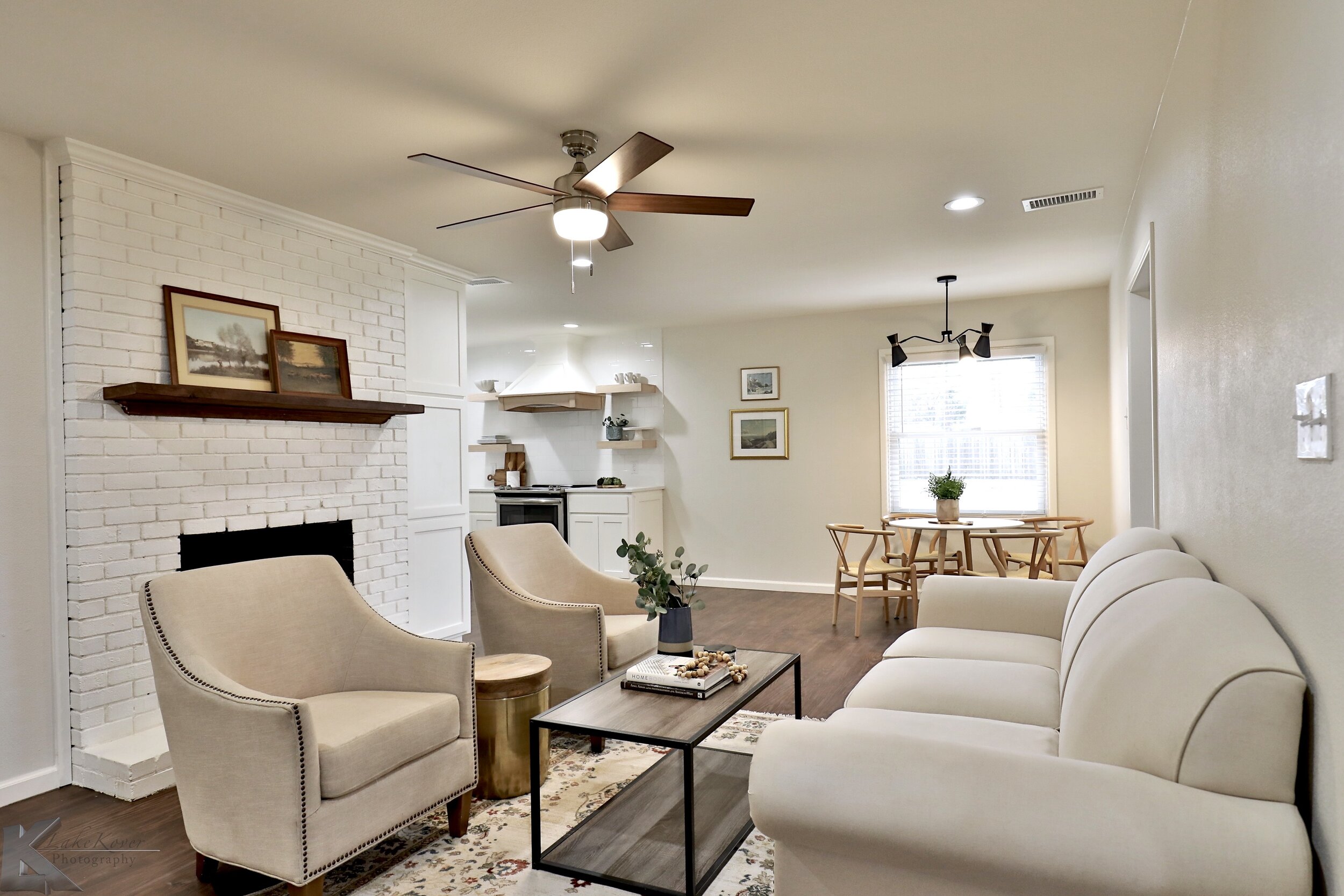
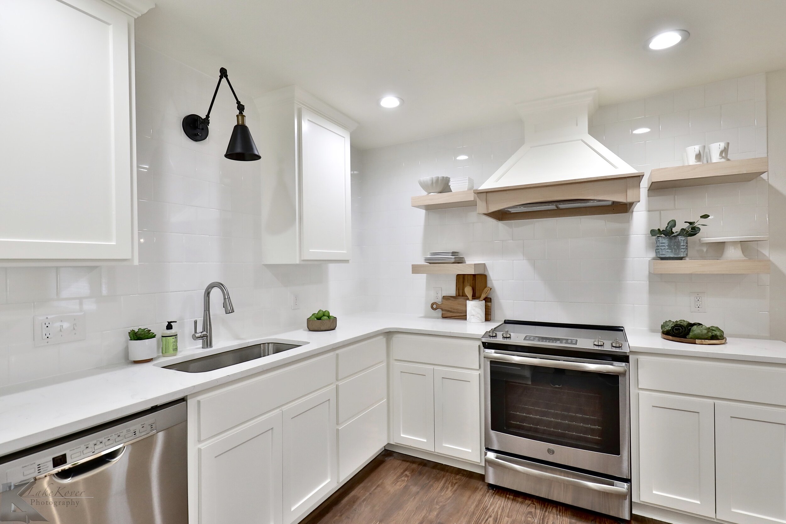
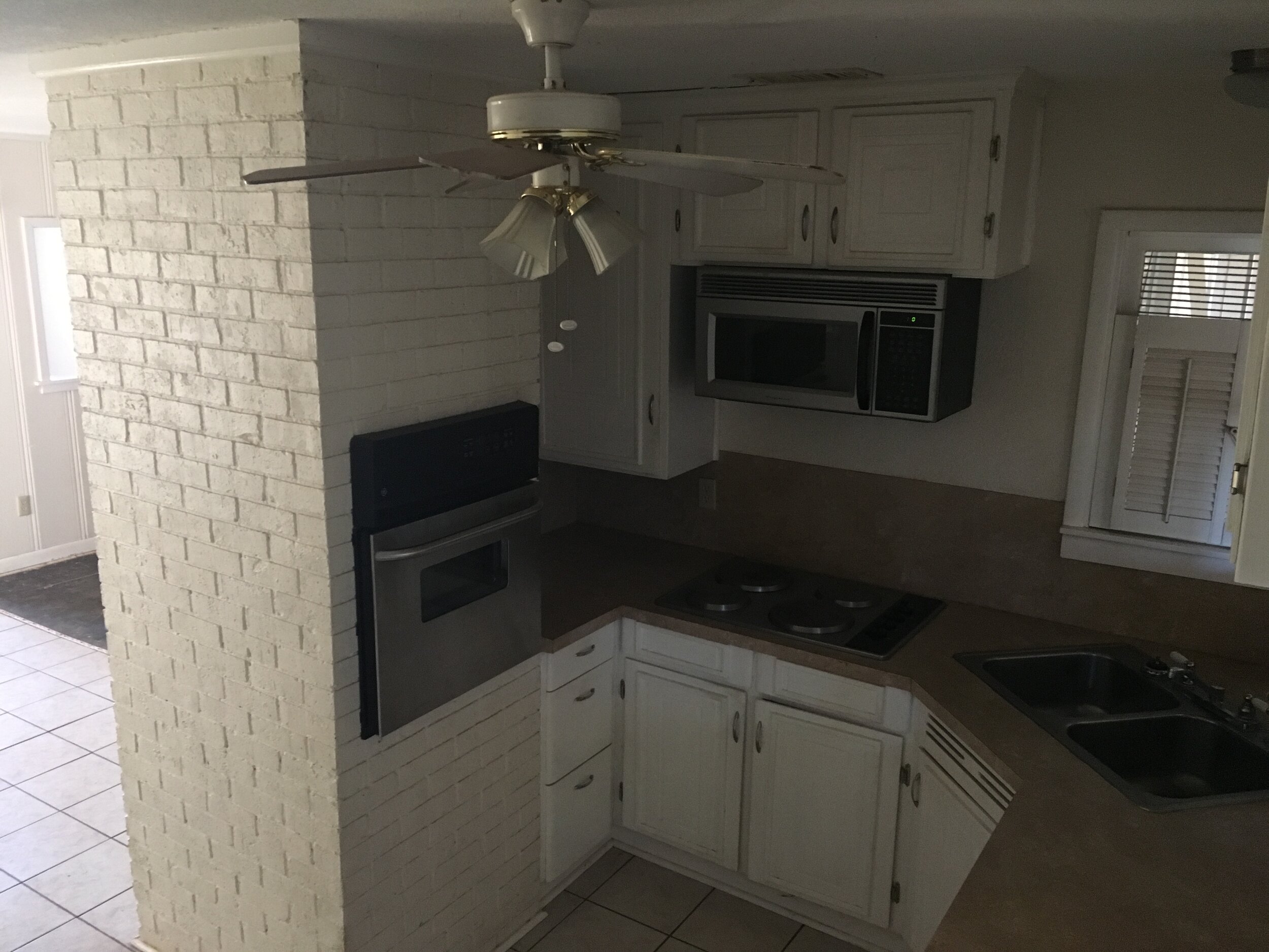
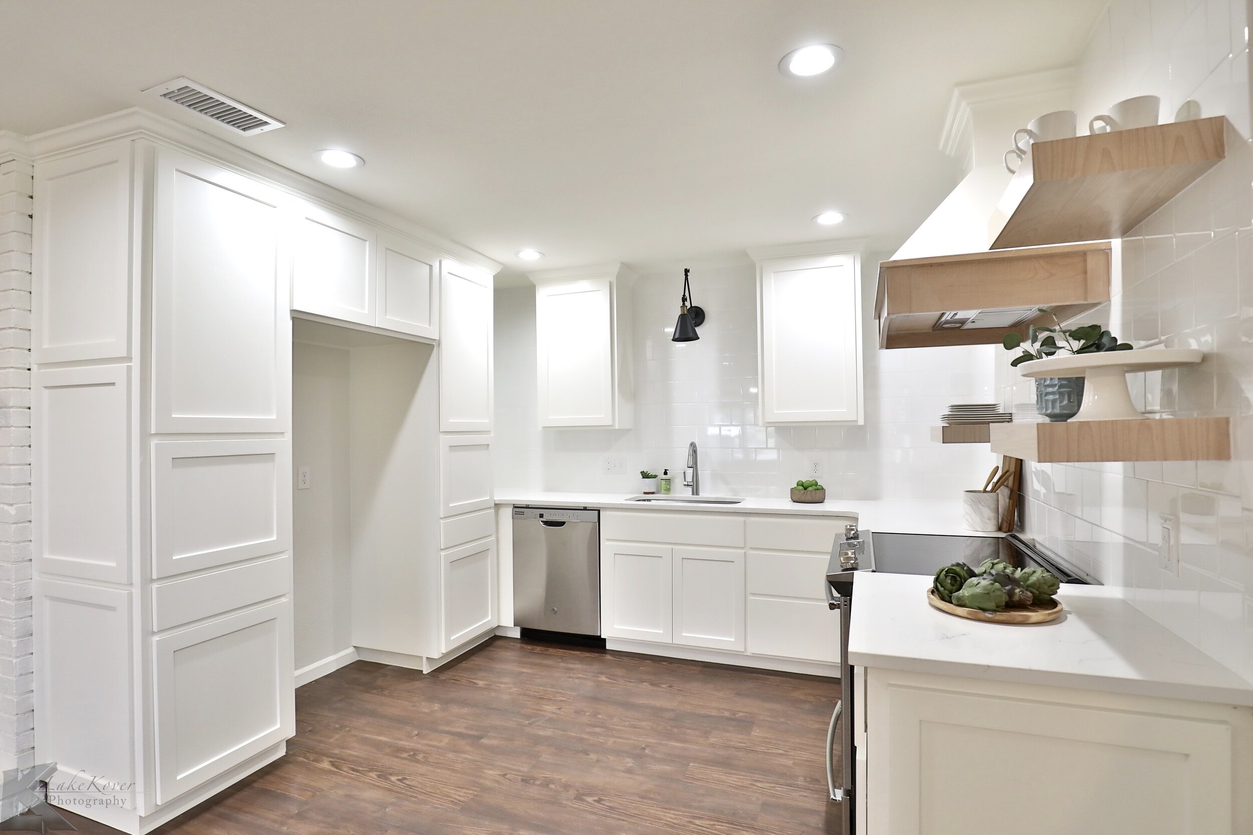
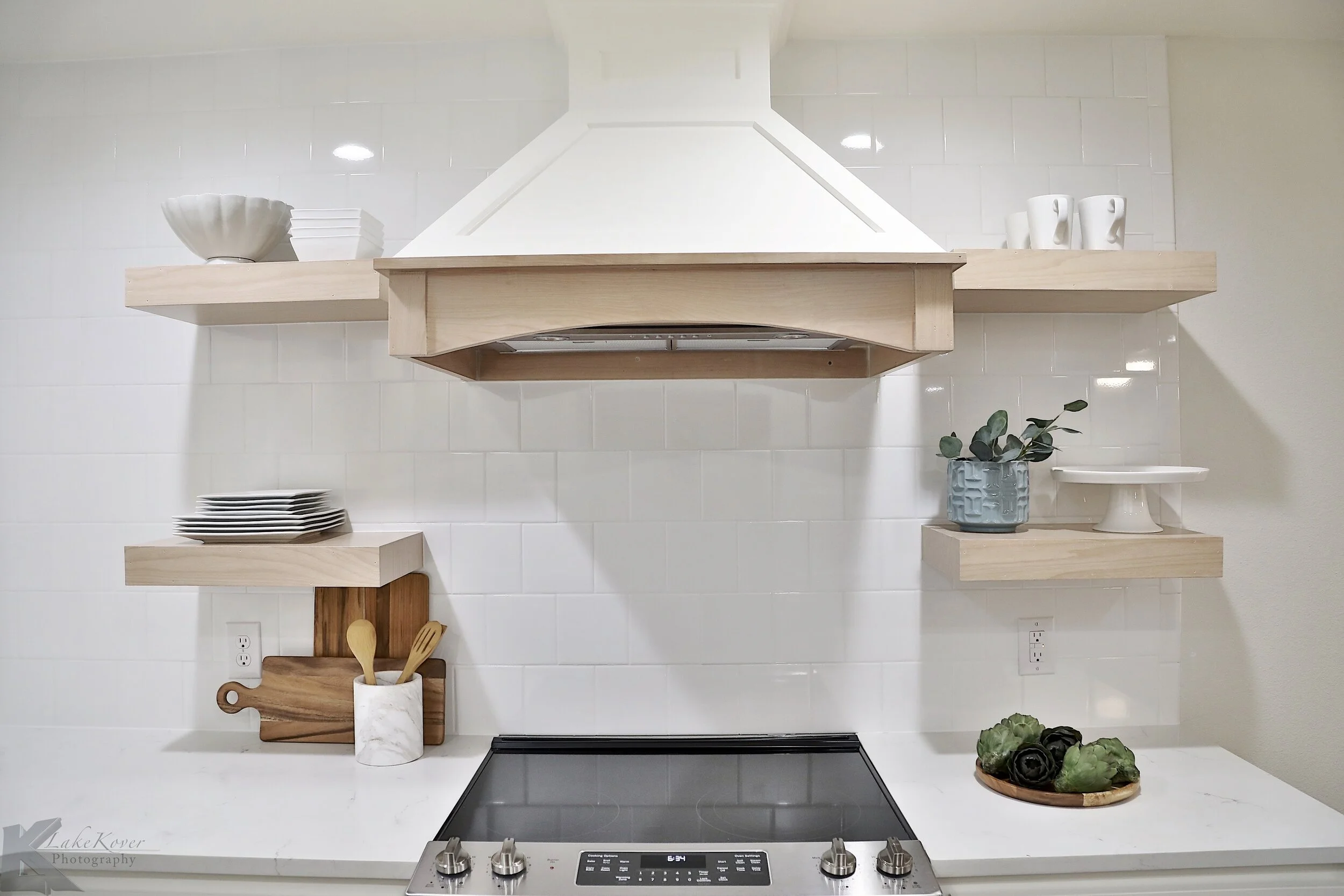
The brick fireplace turned out so cute with just some paint! All of the kitchen was demo’ed and its corkiness. We opened up the flow little bit in this area by coming back with less bulky cabinets. And keeping the uppers really simple and open helped the space feel bigger.
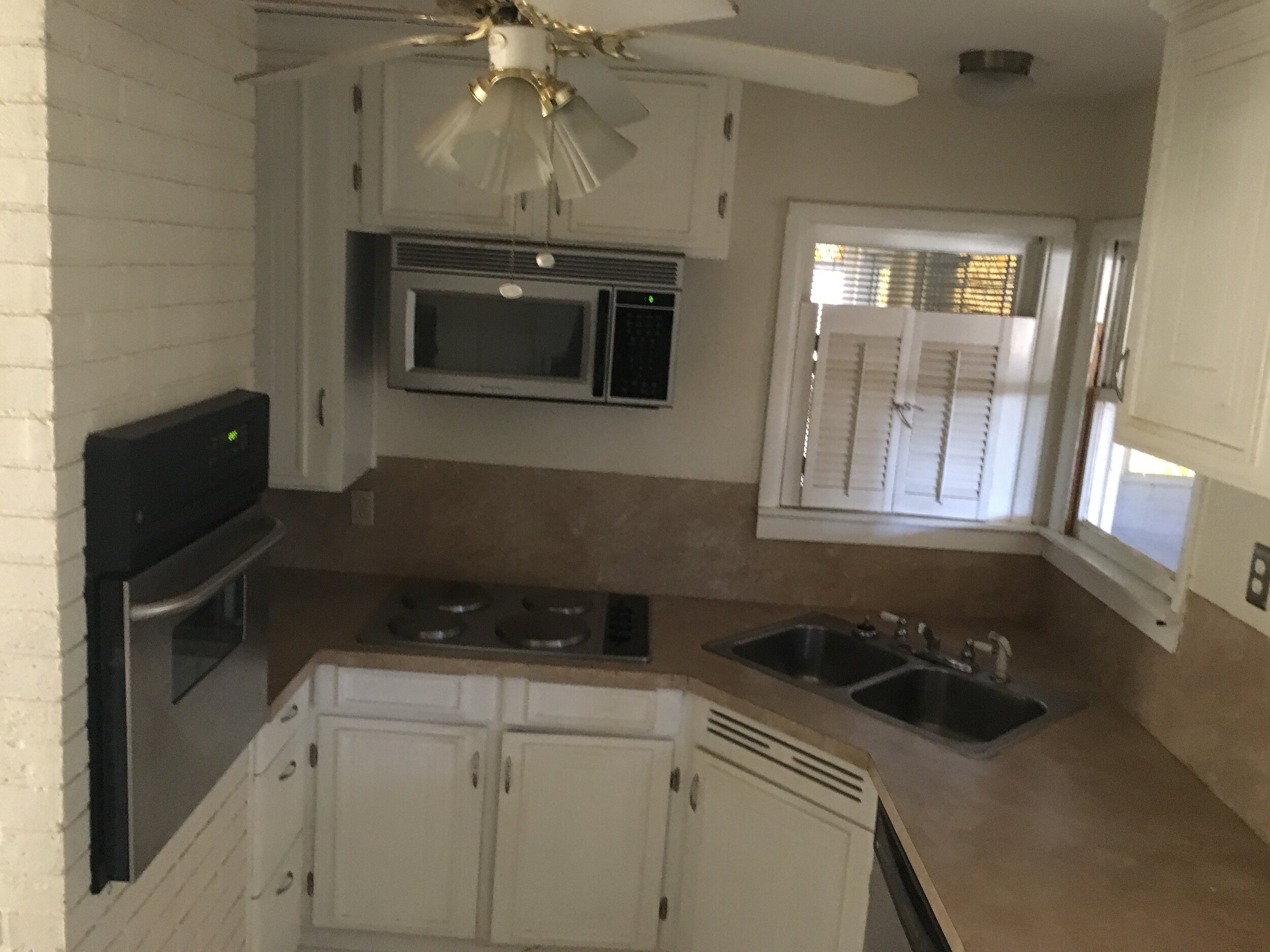
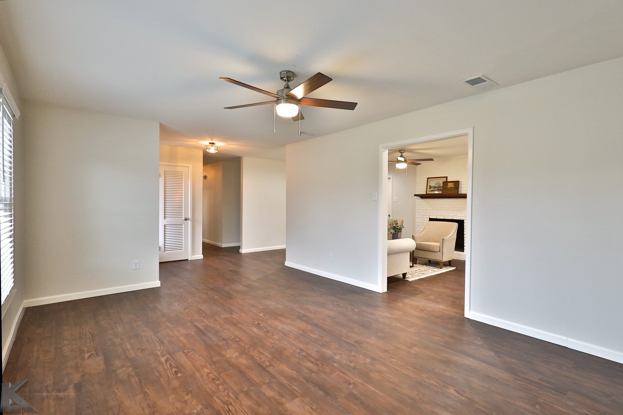
This kitchen was tiny and had a faux brick wall that really closed off the space. Taking out the wall opened up the kitchen to flow into the living and dining room better. We designed an enclosed refrigerator cabinet to utilize the room around the refrigerator for storage from the ceiling to the floor.
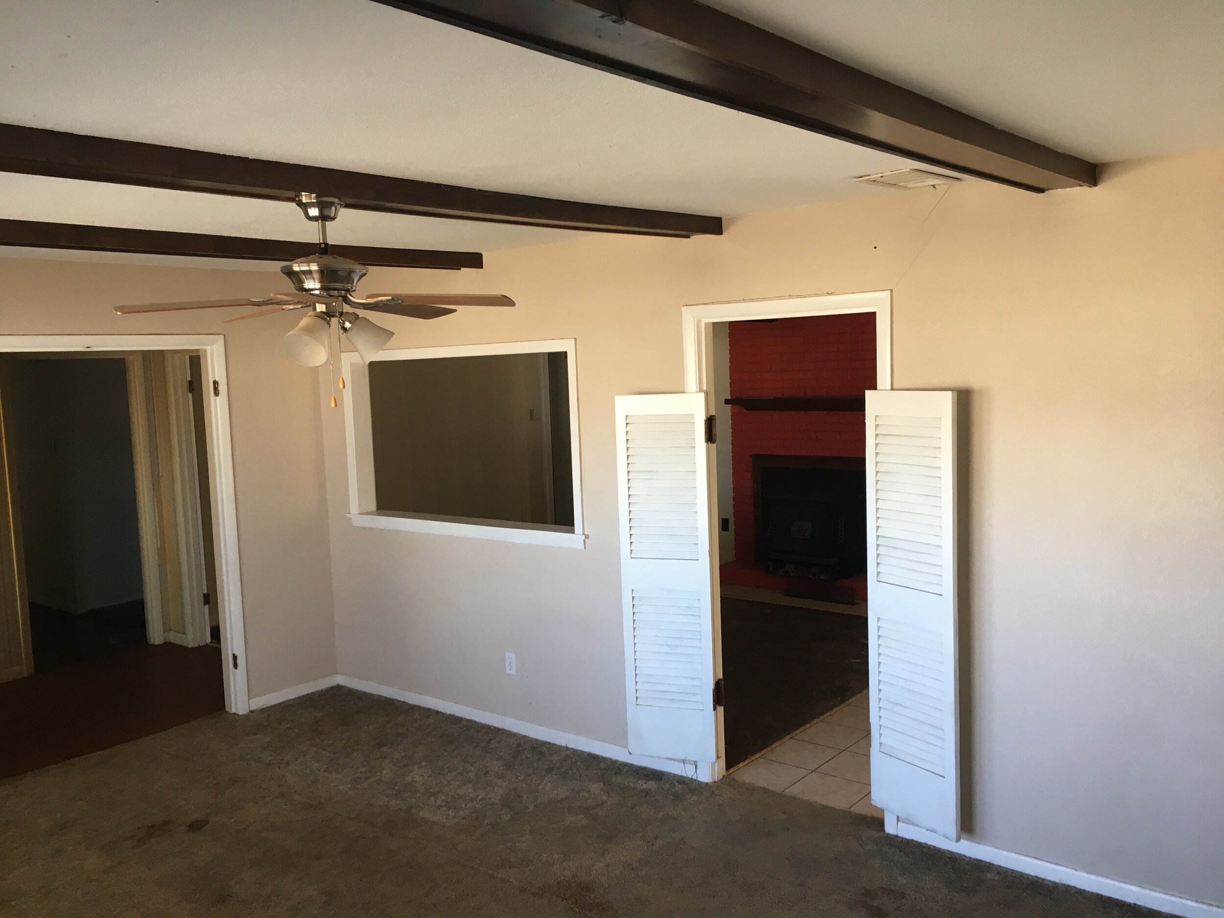
The front room was really awkward with the swinging saloon type doors and random pass through window. We opened up the door ways leading into this room, the living room and the hallway so the sheetrock was flush with the ceiling. Maybe something that doesn’t seem like it would be a big deal but I think it goes a long way in making the house feel cohesive.
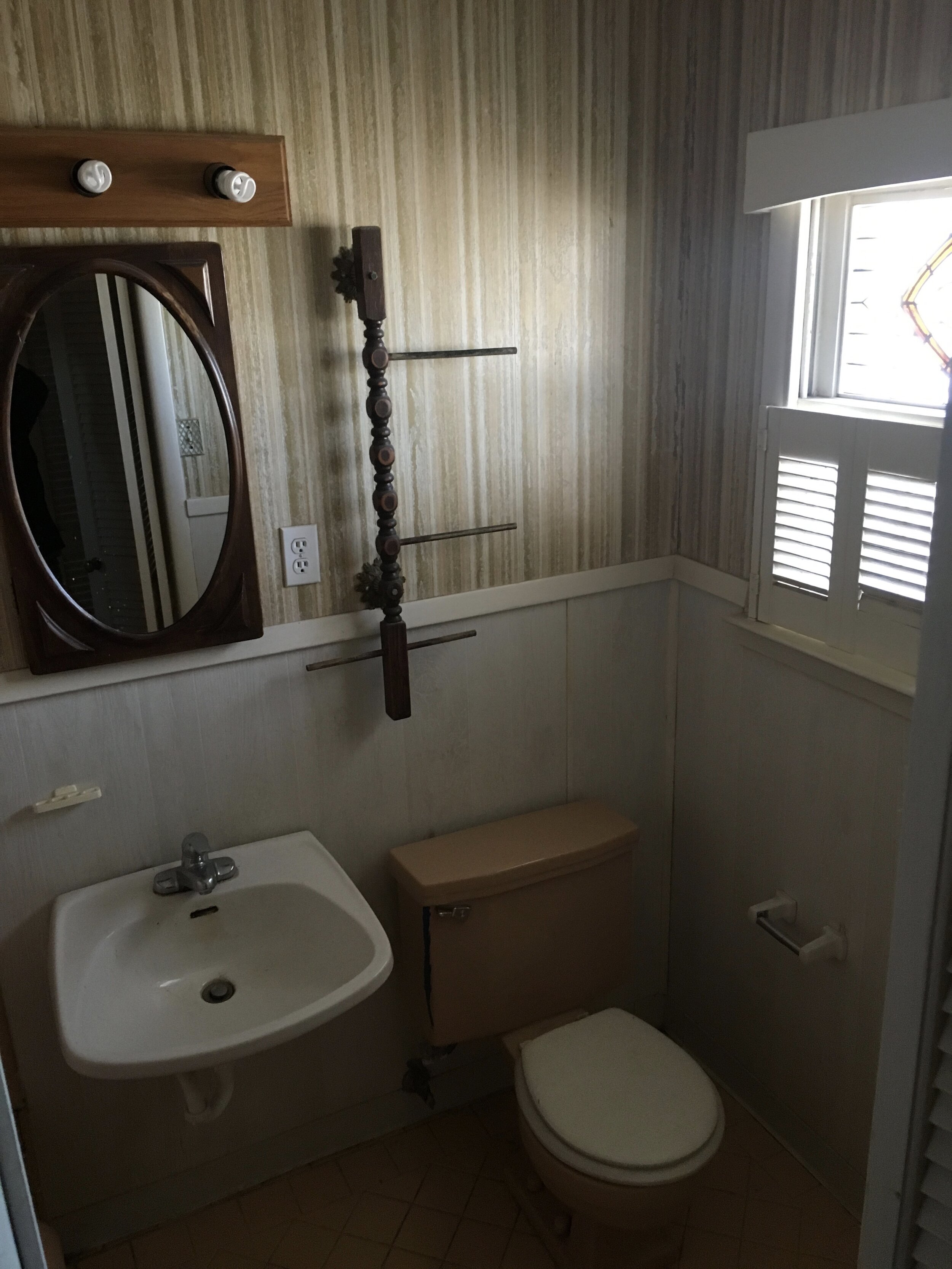
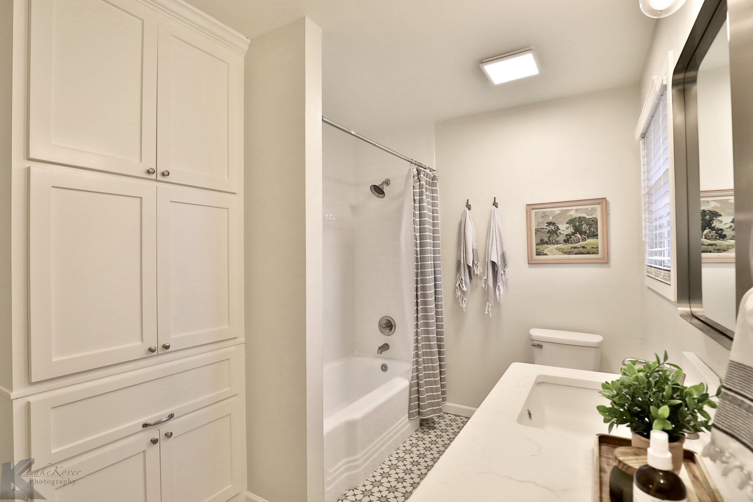
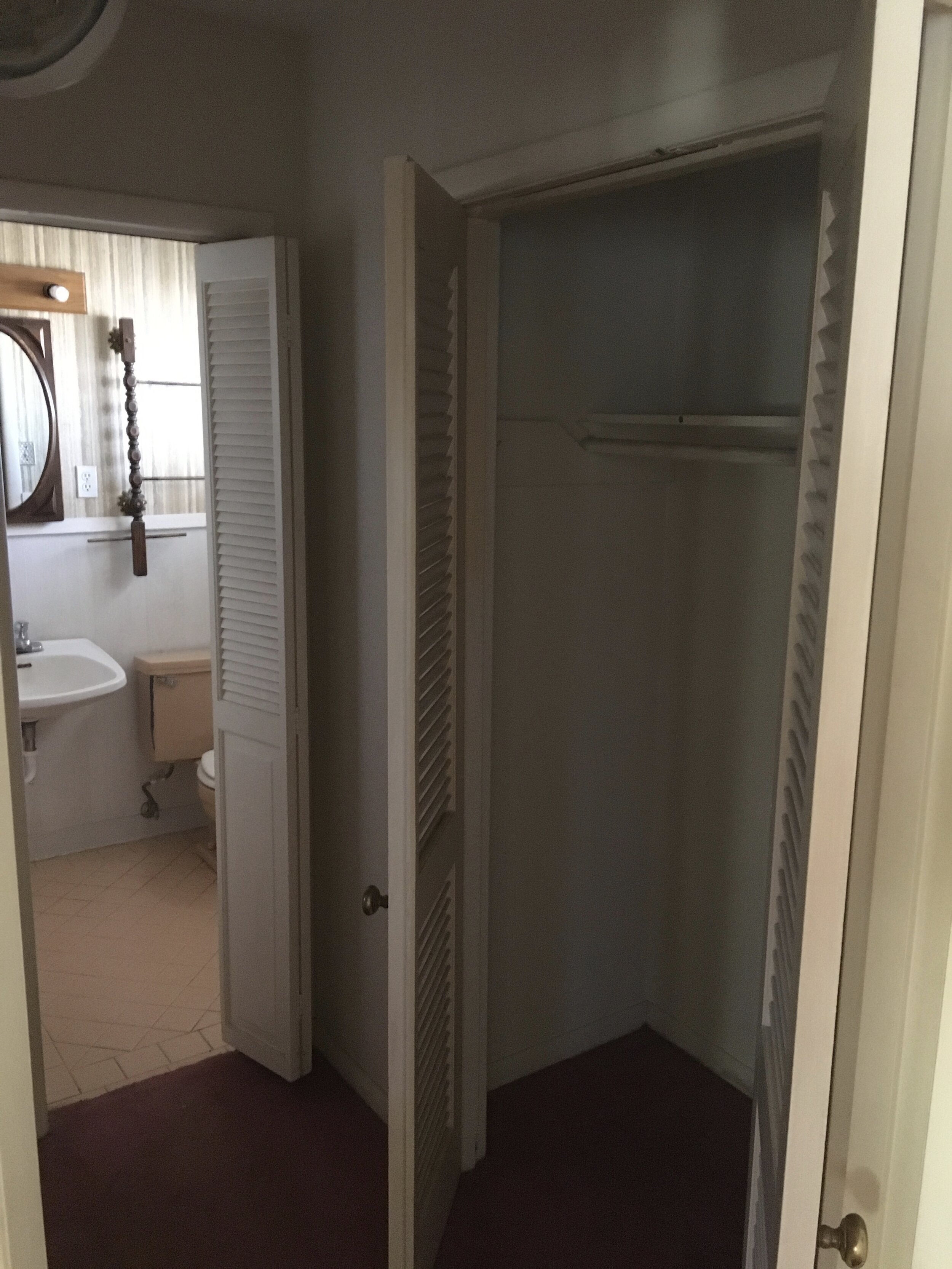
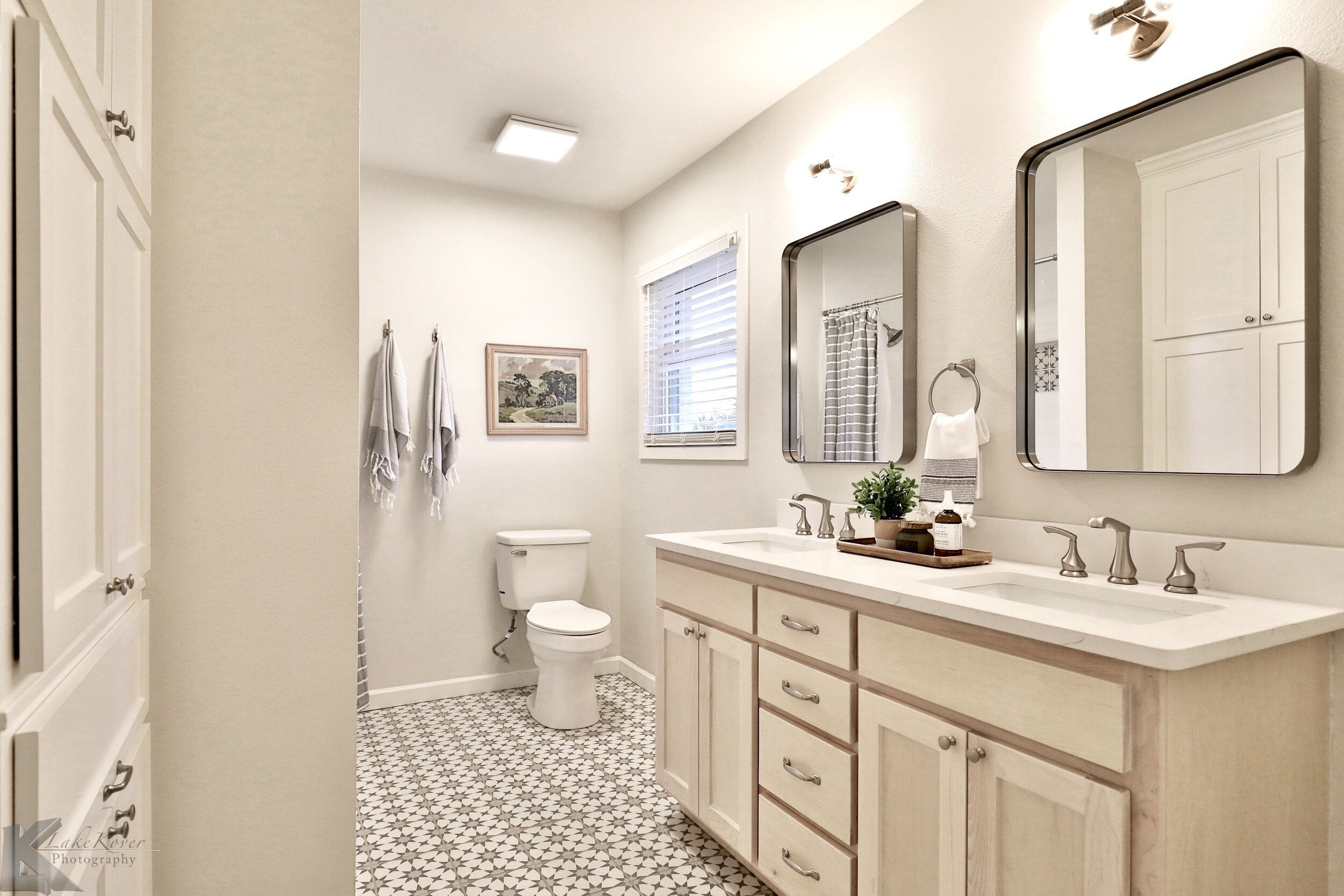
A ton of work was put into the master bathroom with the layout and design! Like the rest of the house it was weird spaces, chopped up, and felt confusing. The master bedroom already had two large closets so we didn’t feel too bad taking out one of the closets to add room for a double sink vanity. We used beech wood on the vanity and very light stain.
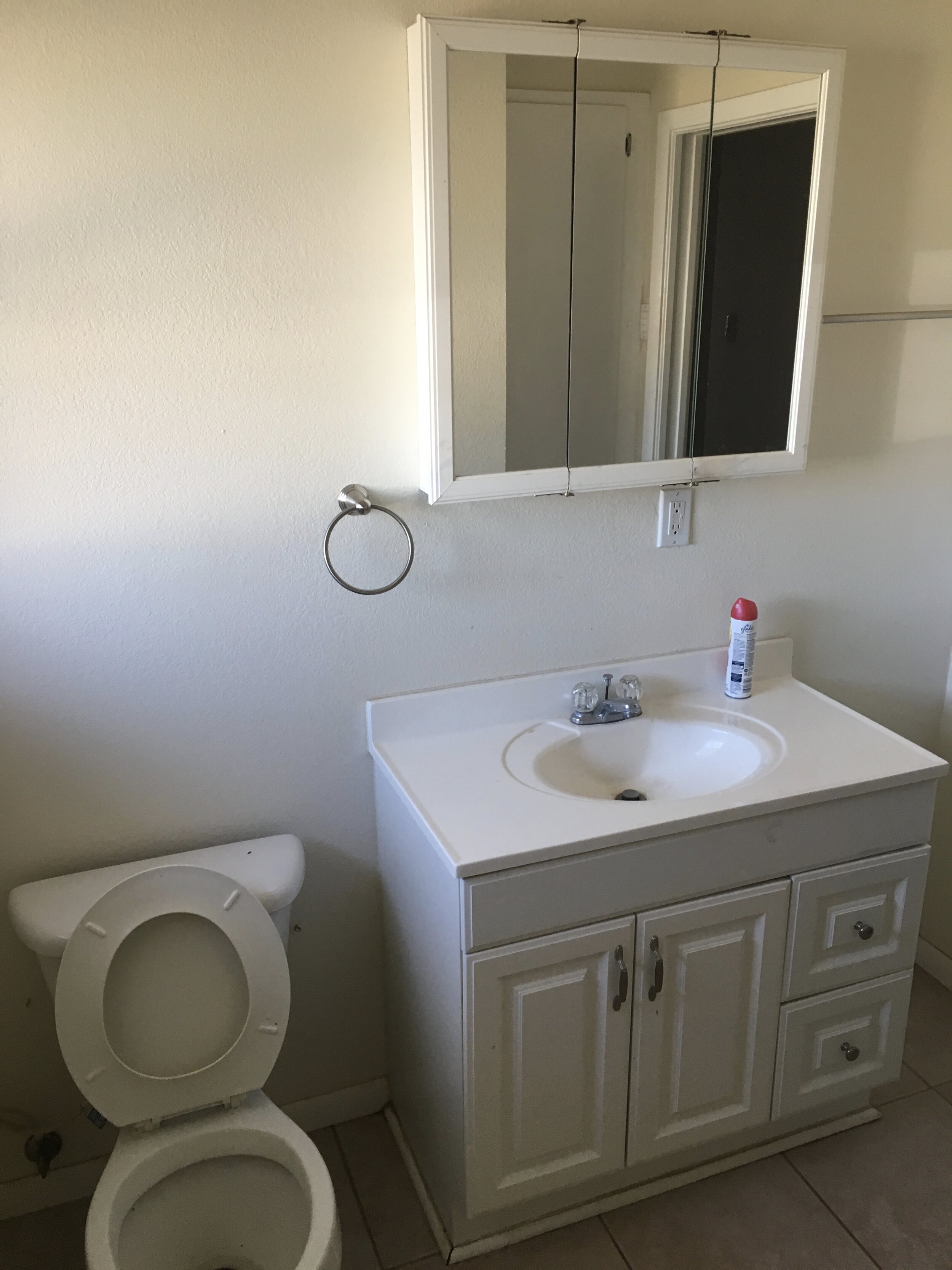
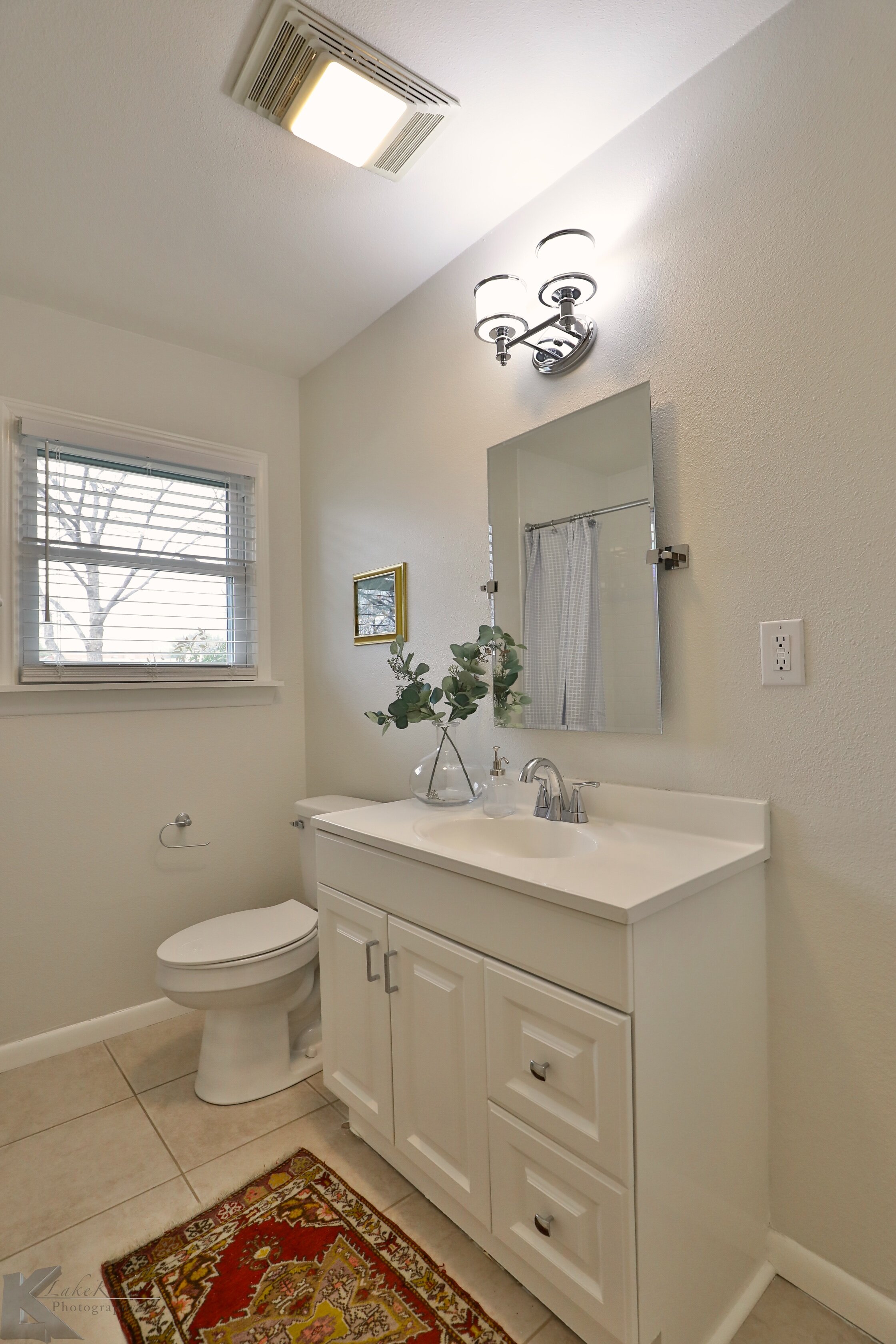
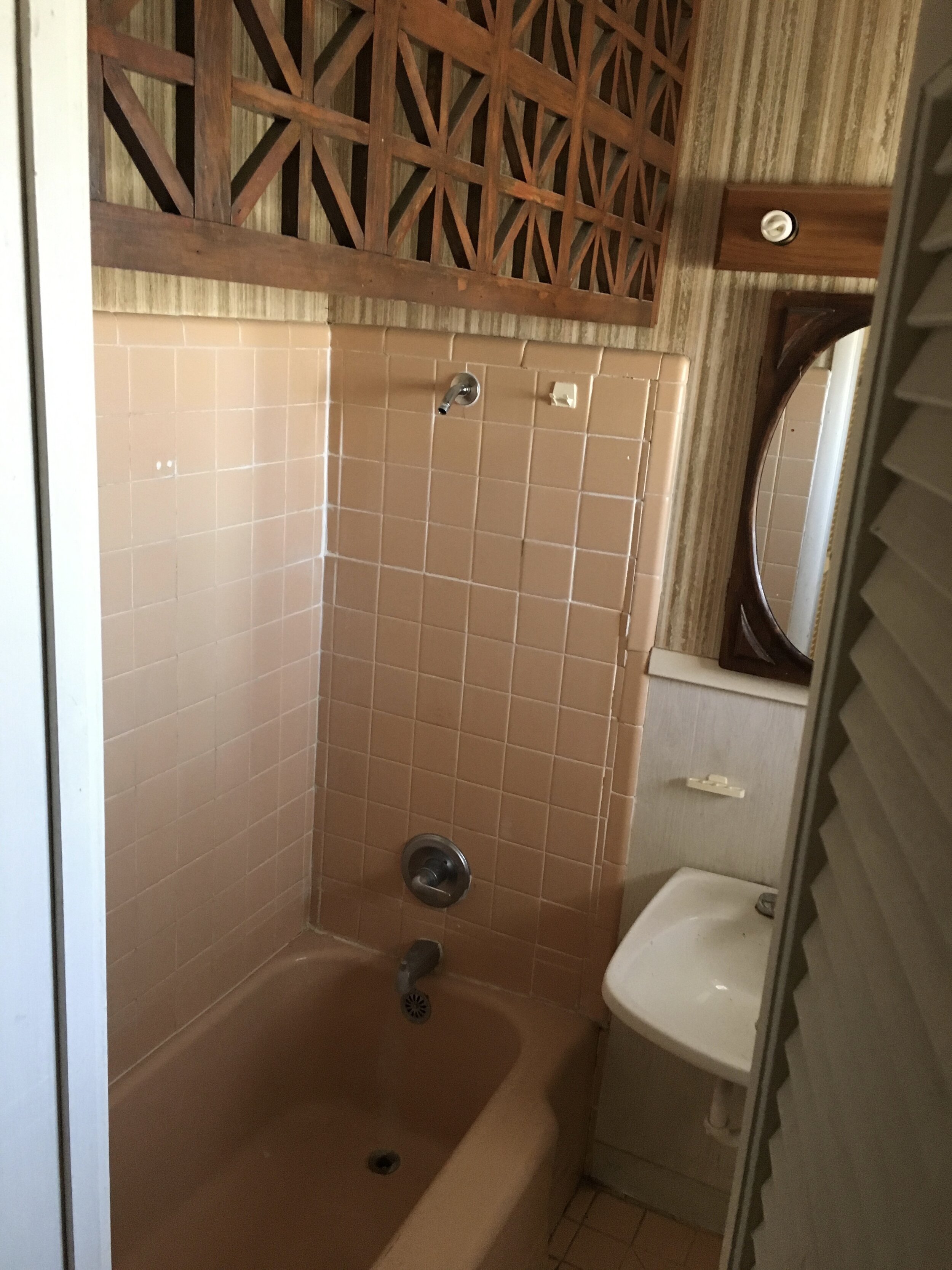
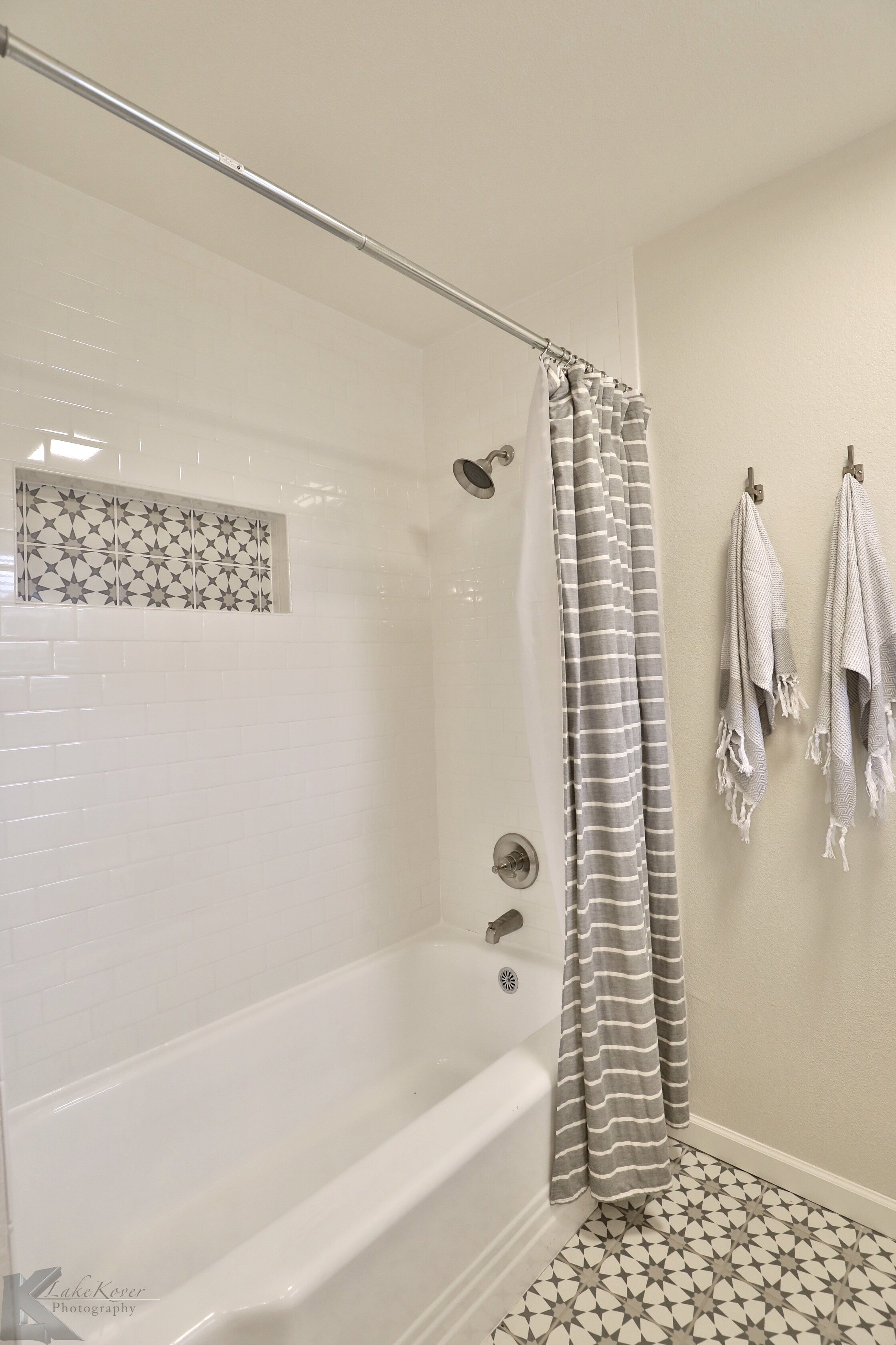
The hall bath cleaned up nicely with some new fixtures and paint.
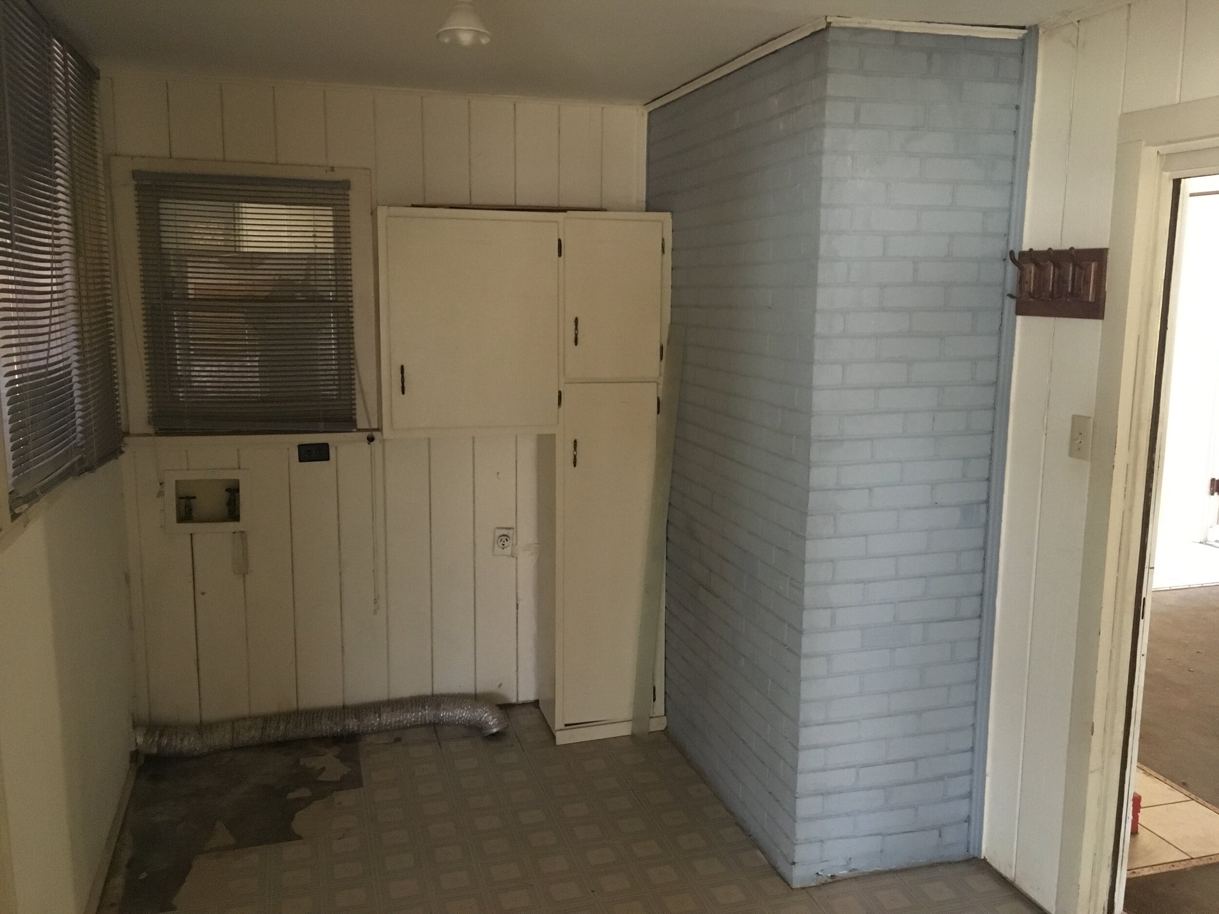
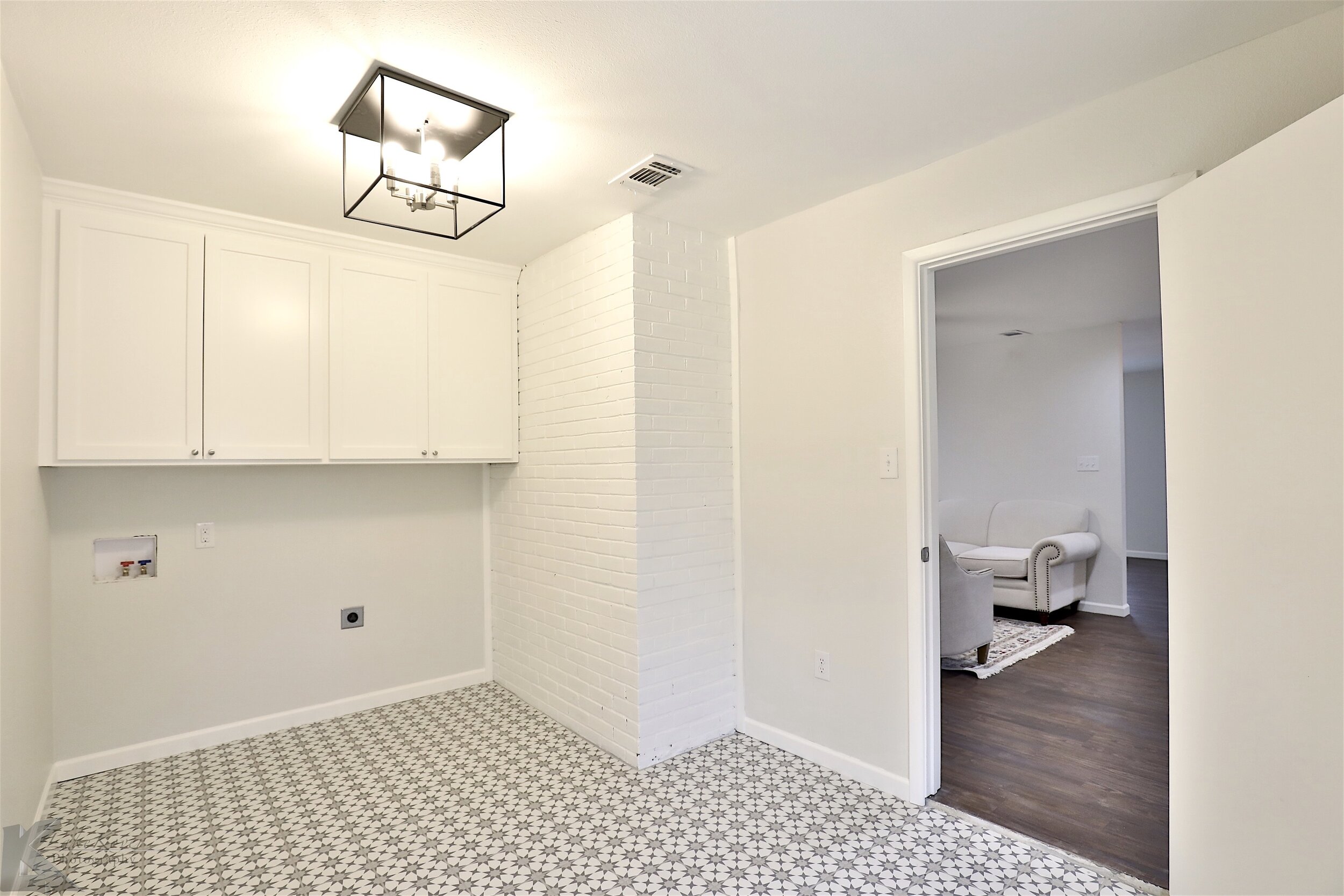
As much as it would have been nice to keep this vertical shiplap it would have been too hard to patch with all the odd windows and doors we needed to close in. We love adding a pop in smaller spaces and this tile was perfect for the laundry room. Its a porcelain tile from Home Depot that looks like the super popular cement tile but the new owners wont have to deal with the upkeep of real cement tile!
Reaching the finish line on this project felt really nice! It turned out to be something we are proud of and it wasn’t the ugly house on the block anymore!


